Bootstrap icons
Содержание:
- Пользовательские компоненты
- Загрузка фреймворка Bootstrap
- Типография
- Функционал разметки
- Contextual classes
- Как это работает
- Поддержка браузерами
- Responsive classes
- How it works
- Quick start
- Customizing the grid
- Печать
- CSPs and embedded SVGs
- How it works
- Компонентам
- Как установить Bootstrap
- Модули, navbars, и виртуальные клавиатуры
- Internet Explorer 8 и Respond.js
- Тип
- Alignment
Пользовательские компоненты

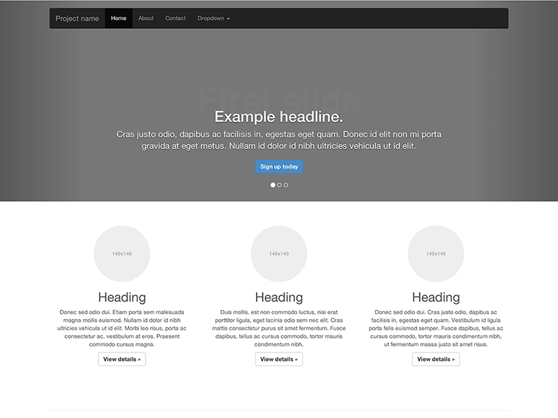
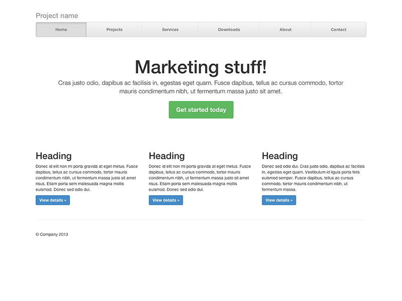
Одностраничный шаблон для построения простых и красивых домашних страниц.
Сочетание в шаблоне нав. меню и карусели, с добавлением некоторых новых компонентов.
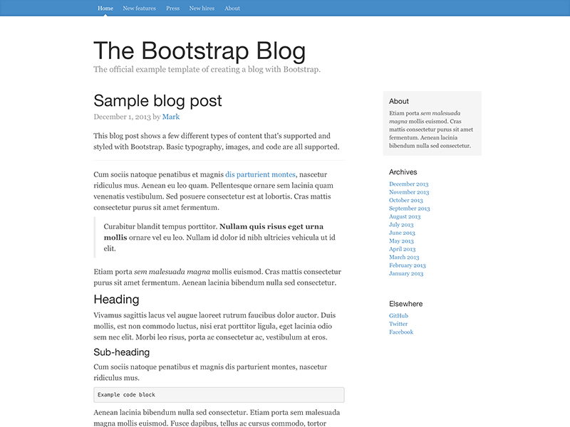
Простой блог в две колонки с пользовательской навигацией, заголовком, и видом.
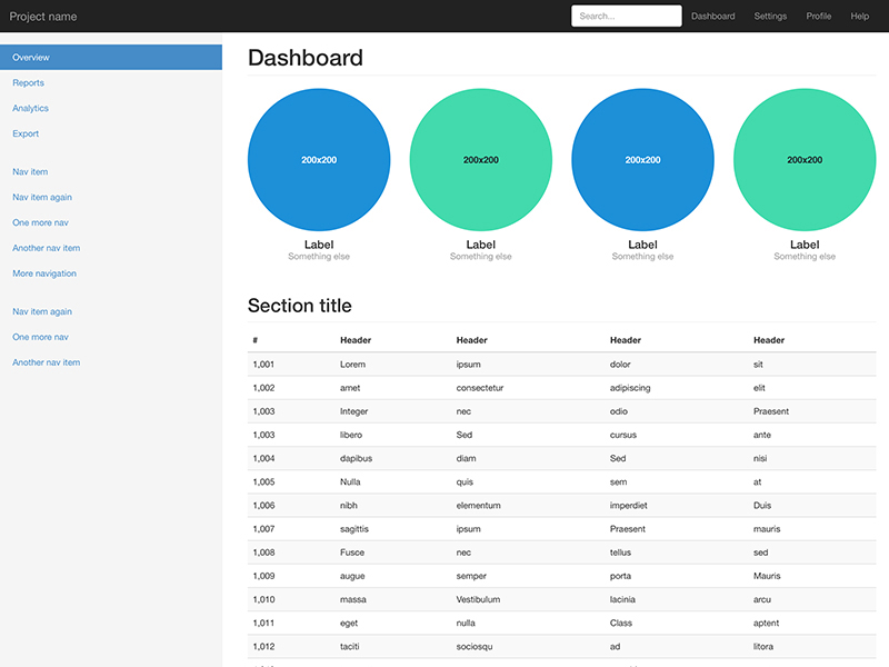
Базовая структура для администратора приборная панель с фиксированным боковым меню и панели навигации.
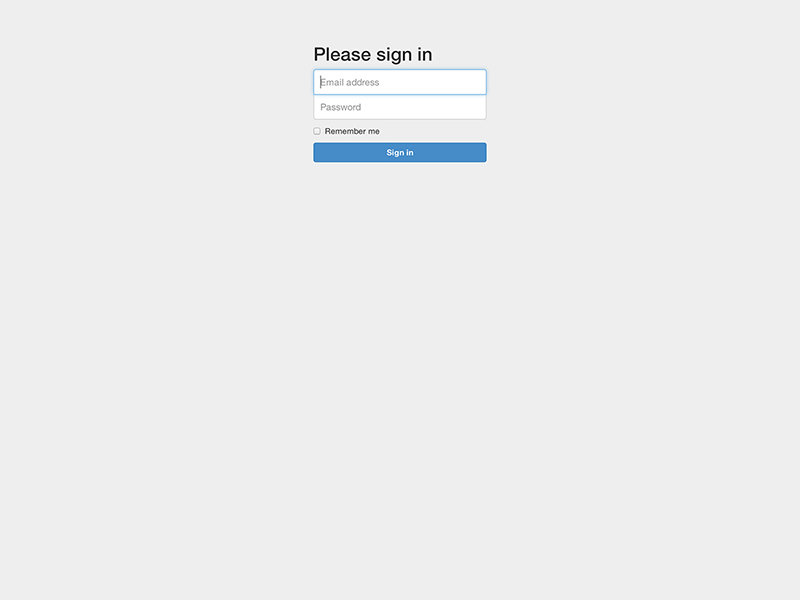
Шаблон пользовательской формы настроен для простого входа на сайт.
Создание компонованого нав. меню с выровненными ссылками
Внимание!
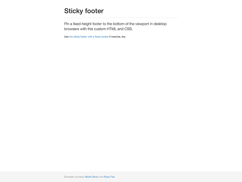
Закрепление колонтитула в нижней части браузера для случая, когда высота контента сама собой не делает этого.
Загрузка фреймворка Bootstrap
Создание веб-проекта, в основу дизайна которого положен фреймворк Bootstrap всегда начинают с его загрузки. Загрузить фреймворк Bootstrap можно различными способами. Например, посредством ссылки, расположенной на сайте getbootstrap.com или с помощью пакетного менеджера npm, Composer, Bower или др. Способ как это осуществить зависит от вашего опыта или конкретной ситуации.
Наиболее просто выполнить загрузку – это воспользоваться ссылкой. На сайте Bootstrap присутствуют 2 ссылки.
Первая ссылка содержит готовые к использованию файлы CSS и JavaScript. Эту сборку в основном используют для изучения фреймворка или для использования в проектах, дизайн которых может быть выполнен в стилях заложенных авторами по умолчанию.
Скачать Bootstrap 3.4.1Скачать Bootstrap 4.6.0Скачать Bootstrap 5.0.0-beta2
Вторая ссылка содержит фреймворк в исходных кодах. Эта версия более удобна для разработки сайтов, т.к. позволяет очень просто изменить стили, цветовую гамму компонентов, выполнить их настройку и др. Но эти исходные файлы, перед тем как использовать на странице, нужно будет скомпилировать и минимизировать. Данный процесс обычно автоматизируют, например, с помощью Gulp.
Исходные коды Bootstrap 3.4.1Исходные коды Bootstrap 4.6.0Исходные коды Bootstrap 5.0.0-beta2
Типография
Шрифт, интервал, цвет для основного текста, заголовков, и многое другое.
@font-family-sans-serif
@font-family-serif
@font-family-monospace
По умолчанию шрифт monospace для , , и .
@font-family-base
@font-size-base
@font-size-large
@font-size-small
@font-size-h1
@font-size-h2
@font-size-h3
@font-size-h4
@font-size-h5
@font-size-h6
@line-height-base
Измерение-less для использования в компонентах как кнопки.
@line-height-computed
Компьютерная и Quot; высота строки и Quot; ( * ) для использования с , ,и т.д.
@headings-font-family
По умолчанию этот наследуется от .
@headings-font-weight
@headings-line-height
@headings-color
Функционал разметки
При Bootstrap использует s или s для определения большинства размеров, s применяются для грид точки останова и ширины контейнера. Это происходит потому, что Ширина области просмотра в пикселях и не меняется с .
Смотри как аспекты Bootstrap блочная система работают на нескольких устройствах с таблица.
| Сверхмалые<544px | Небольшой≥544px | Средний≥768px по | Большие≥992px | Очень большой≥1200px | |
|---|---|---|---|---|---|
| Поведение разметки | Horizontal at all times | Collapsed to start, horizontal above breakpoints | |||
| Ширина контейнера | None (auto) | 576px | 720px | 940px | 1140px |
| Класс префикса | |||||
| # колонок | 12 | ||||
| Промежуточная ширина | 1.875rem / 30px (15px on each side of a column) | ||||
| Вкладка | Yes | ||||
| Отступ | Yes | ||||
| Выравнивание столбцов | Yes |
Contextual classes
Use contextual classes to color table rows or individual cells.
| Class | Description |
|---|---|
| Applies the hover color to a particular row or cell | |
| Indicates a successful or positive action | |
| Indicates a neutral informative change or action | |
| Indicates a warning that might need attention | |
| Indicates a dangerous or potentially negative action |
| # | Column heading | Column heading | Column heading |
|---|---|---|---|
| 1 | Column content | Column content | Column content |
| 2 | Column content | Column content | Column content |
| 3 | Column content | Column content | Column content |
| 4 | Column content | Column content | Column content |
| 5 | Column content | Column content | Column content |
| 6 | Column content | Column content | Column content |
| 7 | Column content | Column content | Column content |
| 8 | Column content | Column content | Column content |
| 9 | Column content | Column content | Column content |
Regular table background variants are not available with the inverse table, however, you may use text or background utilities to achieve similar styles.
| # | Column heading | Column heading | Column heading |
|---|---|---|---|
| 1 | Column content | Column content | Column content |
| 2 | Column content | Column content | Column content |
| 3 | Column content | Column content | Column content |
| 4 | Column content | Column content | Column content |
| 5 | Column content | Column content | Column content |
| 6 | Column content | Column content | Column content |
| 7 | Column content | Column content | Column content |
| 8 | Column content | Column content | Column content |
| 9 | Column content | Column content | Column content |
Conveying meaning to assistive technologies
Using color to add meaning only provides a visual indication, which will not be conveyed to users of assistive technologies – such as screen readers. Ensure that information denoted by the color is either obvious from the content itself (e.g. the visible text), or is included through alternative means, such as additional text hidden with the class.
Как это работает
На высоком уровне, блочная система работает так:
- Существует три основных компонента—контейнера, строки и столбцы.
- Контейнеры— для фиксированной ширины или на полную ширину—центрирует содержание вашего сайта и помогает выровнять содержание блока.
- «Rows» — горизонтальные группы столбцов, которые обеспечивают чтобы столбцы выстроились правильно.
- Контент должен быть помещен в столбцах, и только колонки могут быть непосредственными потомками строк.
- Классы столбце указано количество столбцов, которые вы хотите использовать из 12 возможных в ряду. Так что если вы хотите три равные ширины столбцов, нужно использовать .
- Столбец устанавливаются в процентах, так они всегда изменчивый и размерами по отношению к родительскому элементу.
- Столбцы имеют горизонтальную для создания промежутка между отдельными столбцами.
- Есть пять грид уровней, по одному для каждой : сверхмалые, малые, средние, большие, и очень большие.
- Грид уровни основываются на минимальной ширине, то есть они применяются к ярусу и всем, кто выше его (например, применим для малых, средних, больших, и очень больших устройств).
- Вы можете использовать предопределенные грид классов или Sass примеси для более семантической разметки.
Звучит хорошо? Отлично, давайте перейдем посмотрев все это на примерах.
Поддержка браузерами
В частности, мы поддерживаем последние версии из следующих браузеров и платформ.
Альтернативные браузеры, которые используют последнюю версию WebKit, blink, или Гекко, будь то напрямую или через веб-платформы просмотреть API, явно не поддерживается. Однако, Bootstrap должна (в большинстве случаев) дисплей и работает в этих браузерах, а также. Более конкретные сведения приводятся ниже.
Мобильных устройств
Вообще говоря, Bootstrap поддерживает последние версии браузеров каждой крупной платформы по умолчанию
Обратите внимание, что прокси-браузеры (такие как Опера Мини, Турбо-режим в Opera мобильный, браузер, Амазонки шелк) не поддерживаются
| Chrome | В Firefox | Safari | |
|---|---|---|---|
| Android | Supported | Supported | N/A |
| iOS | Supported | Supported | Supported |
Браузеры для ПК
Аналогично, последние версии самых десктопные браузеры поддерживаются.
| Chrome | В Firefox | Internet Explorer | Opera | Safari | |
|---|---|---|---|---|---|
| Mac | Supported | Supported | N/A | Supported | Supported |
| Windows | Supported | Supported | Supported | Supported | Not supported |
В Windows мы поддерживаем Internet Explorer 8-11.
Для Firefox, в дополнение к последней нормальной стабильной версии, мы также поддерживаем последний Выпуск с расширенной поддержкой (СОЭ) версия браузера Firefox.
Неофициально, Bootstrap должен выглядеть и вести себя достаточно хорошо в Chromium и Chrome для Linux, Firefox для Linux, а также интернет Эксплорер 7, а также Microsoft края, хотя они официально не поддерживаются.
Список некоторых ошибок в брузере, с чем Bootstrap может столкнуться, смотрите наш Баги в браузере.
Responsive classes
Bootstrap’s grid includes five tiers of predefined classes for building complex responsive layouts. Customize the size of your columns on extra small, small, medium, large, or extra large devices however you see fit.
All breakpoints
For grids that are the same from the smallest of devices to the largest, use the and classes. Specify a numbered class when you need a particularly sized column; otherwise, feel free to stick to .
col
col
col
col
col-8
col-4
Stacked to horizontal
Using a single set of classes, you can create a basic grid system that starts out stacked on extra small devices before becoming horizontal on desktop (medium) devices.
col-sm-8
col-sm-4
col-sm
col-sm
col-sm
Mix and match
Don’t want your columns to simply stack in some grid tiers? Use a combination of different classes for each tier as needed. See the example below for a better idea of how it all works.
.col .col-md-8
.col-6 .col-md-4
.col-6 .col-md-4
.col-6 .col-md-4
.col-6 .col-md-4
.col-6
.col-6
How it works
Bootstrap’s grid system uses a series of containers, rows, and columns to layout and align content. It’s built with flexbox and is fully responsive. Below is an example and an in-depth look at how the grid comes together.
One of three columns
One of three columns
One of three columns
The above example creates three equal-width columns on small, medium, large, and extra large devices using our predefined grid classes. Those columns are centered in the page with the parent .
Breaking it down, here’s how it works:
- Containers provide a means to center your site’s contents. Use for fixed width or for full width.
- Rows are horizontal groups of columns that ensure your columns are lined up properly. We use the negative margin method on to ensure all your content is aligned properly down the left side.
- Content should be placed within columns, and only columns may be immediate children of rows.
- Thanks to flexbox, grid columns without a set width will automatically layout with equal widths. For example, four instances of will each automatically be 25% wide for small breakpoints.
- Column classes indicate the number of columns you’d like to use out of the possible 12 per row. So, if you want three equal-width columns, you can use .
- Column s are set in percentages, so they’re always fluid and sized relative to their parent element.
- Columns have horizontal to create the gutters between individual columns, however, you can remove the from rows and from columns with on the .
- There are five grid tiers, one for each : all breakpoints (extra small), small, medium, large, and extra large.
- Grid tiers are based on minimum widths, meaning they apply to that one tier and all those above it (e.g., applies to small, medium, large, and extra large devices).
- You can use predefined grid classes or Sass mixins for more semantic markup.
Be aware of the limitations and bugs around flexbox, like the .
Sounds good? Great, let’s move on to seeing all that in an example.
Quick start
Looking to quickly add Bootstrap to your project? Use jsDelivr, a free open source CDN. Using a package manager or need to download the source files? Head to the downloads page.
JS
Many of our components require the use of JavaScript to function. Specifically, they require jQuery, Popper, and our own JavaScript plugins. We use jQuery’s slim build, but the full version is also supported.
Place one of the following s near the end of your pages, right before the closing tag, to enable them. jQuery must come first, then Popper, and then our JavaScript plugins.
Bundle
Include every Bootstrap JavaScript plugin with one of our two bundles. Both and include Popper for our tooltips and popovers, but not jQuery. Include jQuery first, then a Bootstrap JavaScript bundle. For more information about what’s included in Bootstrap, please see our section.
Separate
If you decide to go with the separate scripts solution, Popper must come first (if you’re using tooltips or popovers), and then our JavaScript plugins.
Components
Curious which components explicitly require jQuery, our JavaScript, and Popper? Click the show components link below. If you’re unsure about the page structure, keep reading for an example page template.
Show components requiring JavaScript
- Alerts for dismissing
- Buttons for toggling states and checkbox/radio functionality
- Carousel for all slide behaviors, controls, and indicators
- Collapse for toggling visibility of content
- Dropdowns for displaying and positioning (also requires Popper)
- Modals for displaying, positioning, and scroll behavior
- Navbar for extending our Collapse plugin to implement responsive behavior
- Tooltips and popovers for displaying and positioning (also requires Popper)
- Scrollspy for scroll behavior and navigation updates
Customizing the grid
Using our built-in grid Sass variables and maps, it’s possible to completely customize the predefined grid classes. Change the number of tiers, the media query dimensions, and the container widths—then recompile.
Columns and gutters
The number of grid columns and their horizontal padding (aka, gutters) can be modified via Sass variables. is used to generate the widths (in percent) of each individual column while allows breakpoint-specific widths that are divided evenly across and for the column gutters.
Grid tiers
Moving beyond the columns themselves, you may also customize the number of grid tiers. If you wanted just three grid tiers, you’d update the and to something like this:
When making any changes to the Sass variables or maps, you’ll need to save your changes and recompile. Doing so will out a brand new set of predefined grid classes for column widths, offsets, pushes, and pulls. Responsive visibility utilities will also be updated to use the custom breakpoints.
Печать
Даже в некоторых современных браузерах, для обеспечения печати приходится изловчиться.
В частности, в Chrome версии 32 независимо от параметров отступов и размеров полей, Chrome при печати использует значительно более узкую область просмотра, чем физический размер бумаги при отображении медиа запросов. Это может привести к тому, при печати Bootstrap неожиданно активирует очень мелкую сетку. и Ошибке Chrome #273306. Рекомендуемые обходные пути:
- Примените extra-small разметку и убедитесь, что ваша страница выглядит приемлемо.
- Настройка значения Less переменных, чтобы ваш бумага для принтера рассматривалась больше, чем extra-small.
- Добавить Пользовательское медиа запросы изменение грид Размер точки останова для печати медиа только.
Также, как Сафари и v8.0, фиксированной ширины может вызвать Сафари использовать необычайно маленький размер шрифта при печати. См. #14868 и В WebKit ошибка #138192 Для более подробной информации. Одним из возможных обойти это, добавив следующие CSS:
CSPs and embedded SVGs
Several Bootstrap components include embedded SVGs in our CSS to style components consistently and easily across browsers and devices. For organizations with more strict CSP configurations, we’ve documented all instances of our embedded SVGs (all of which are applied via ) so you can more thoroughly review your options.
- Close button (used in alerts and modals)
Based on community conversation, some options for addressing this in your own codebase include replacing the URLs with locally hosted assets, removing the images and using inline images (not possible in all components), and modifying your CSP. Our recommendation is to carefully review your own security policies and decide on a best path forward, if necessary.
How it works
Bootstrap’s grid system uses a series of containers, rows, and columns to layout and align content. It’s built with flexbox and is fully responsive. Below is an example and an in-depth look at how the grid comes together.
New to or unfamiliar with flexbox? for background, terminology, guidelines, and code snippets.
One of three columns
One of three columns
One of three columns
The above example creates three equal-width columns on small, medium, large, and extra large devices using our predefined grid classes. Those columns are centered in the page with the parent .
Breaking it down, here’s how it works:
- Containers provide a means to center and horizontally pad your site’s contents. Use for a responsive pixel width or for across all viewport and device sizes.
- Rows are wrappers for columns. Each column has horizontal (called a gutter) for controlling the space between them. This is then counteracted on the rows with negative margins. This way, all the content in your columns is visually aligned down the left side.
- In a grid layout, content must be placed within columns and only columns may be immediate children of rows.
- Thanks to flexbox, grid columns without a specified will automatically layout as equal width columns. For example, four instances of will each automatically be 25% wide from the small breakpoint and up. See the section for more examples.
- Column classes indicate the number of columns you’d like to use out of the possible 12 per row. So, if you want three equal-width columns across, you can use .
- Column s are set in percentages, so they’re always fluid and sized relative to their parent element.
- Columns have horizontal to create the gutters between individual columns, however, you can remove the from rows and from columns with on the .
- To make the grid responsive, there are five grid breakpoints, one for each : all breakpoints (extra small), small, medium, large, and extra large.
- Grid breakpoints are based on minimum width media queries, meaning they apply to that one breakpoint and all those above it (e.g., applies to small, medium, large, and extra large devices, but not the first breakpoint).
- You can use predefined grid classes (like ) or for more semantic markup.
Be aware of the limitations and bugs around flexbox, like the .
Компонентам
Определите общий padding и размер border и многое другое. Базовые значения 14px текст и 1.428 line-height (~20px to start).
@padding-base-vertical
@padding-base-horizontal
@padding-large-vertical
@padding-large-horizontal
@padding-small-vertical
@padding-small-horizontal
@padding-xs-vertical
@padding-xs-horizontal
@line-height-large
@line-height-small
@border-radius-base
@border-radius-large
@border-radius-small
@component-active-color
Глобальный цвет для активных элементов (т.к. navs or dropdowns).
@component-active-bg
Глобальный фон для активных элементов (т.к. navs or dropdowns).
@caret-width-base
Ширина для создания каре, которые указывают выпадающих меню.
@caret-width-large
Каретка слегка увеличивается в размерах для больших компонентов.
Как установить Bootstrap
Установить Bootstrap можно несколькими способами:
- Подключить компилированные файлы c помощью BootstrapCDN.
- Скачать скомпилированные файлы CSS и JS, подключить их к проекту через ссылки и верстать. Это отличный вариант для того, чтобы познакомиться с фреймворком.
- Скачать исходные файлы. Эта сборка удобнее для верстки, потому что позволяет гибко кастомизировать компоненты. Однако она требует использования дополнительных инструментов: компилятора Sass и постпроцессоров.
- Установить исходники через npm, yarn, RubyGems, Composer, NuGet.
Мы не будем подробно рассматривать все способы — они описаны в документации Bootstrap. Вот версия на русском языке. Она обновляется немного позже официальной инструкции на английском, но порядок установки не меняется годами, так что вся информация актуальна.
Посмотрим способы подключения, которые позволяют быстро получить работающий фреймворк и приступить к изучению его особенностей.
Самый простой метод установки — подключение через BootstrapCDN. Вам не нужно скачивать файлы в проект. Просто создайте шаблон HTML и разместите внутри него ссылку на фреймворк.
Код может быть таким:
<!DOCTYPE html>

<html lang="ru">

<head>

     <meta charset="utf-8">

    <meta name="viewport" content="width=device-width, initial-scale=1, shrink-to-fit=no">

    <!-- Эта ссылка загружает с CDN все необходимые файлы Bootstrap -->

    <link rel="stylesheet" href="https://stackpath.bootstrapcdn.com/bootstrap/4.5.0/css/bootstrap.min.css" integrity="sha384-9aIt2nRpC12Uk9gS9baDl411NQApFmC26EwAOH8WgZl5MYYxFfc+NcPb1dKGj7Sk" crossorigin="anonymous">

</head>

<body>

    <h1>Привет, мир!</h1>

    <!-- Перед закрывающим тегом <body> подключаем jQuery, Popper и Bootstrap JS, чтобы работали интерактивные компоненты  -->

    <script src="https://ajax.googleapis.com/ajax/libs/jquery/3.5.1/jquery.min.js"></script>

    <script src="https://cdn.jsdelivr.net/npm/popper.js@1.16.0/dist/umd/popper.min.js" integrity="sha384-Q6E9RHvbIyZFJoft+2mJbHaEWldlvI9IOYy5n3zV9zzTtmI3UksdQRVvoxMfooAo" crossorigin="anonymous"></script>

    <script src="https://stackpath.bootstrapcdn.com/bootstrap/4.5.0/js/bootstrap.min.js" integrity="sha384-OgVRvuATP1z7JjHLkuOU7Xw704+h835Lr+6QL9UvYjZE3Ipu6Tp75j7Bh/kR0JKI" crossorigin="anonymous" ></script>

</body>

</html>
Еще один простой способ установки — скачивание скомпилированных файлов. Внутри архива (его нужно распаковать) две папки: css и js.
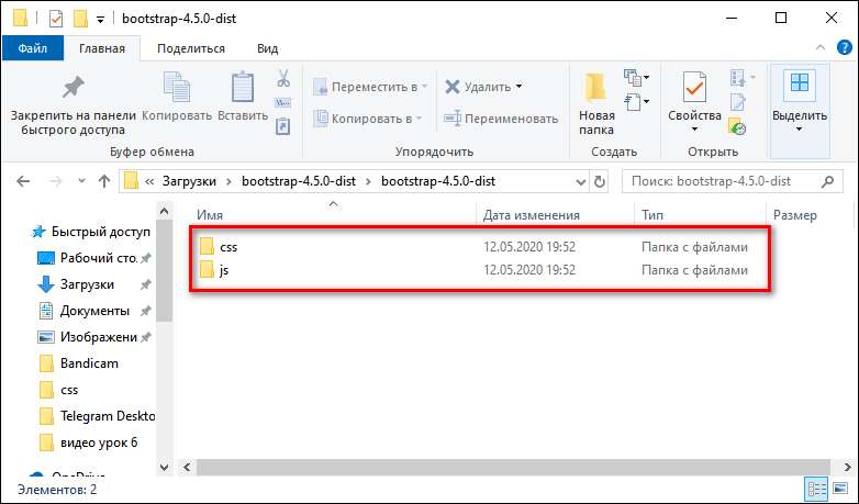 В папке css — файлы стилей.
- bootstrap.css — стили фреймворка. Файл bootstrap.min.css — минифицированная версия.
- bootstrap-grid.css — сетка Bootstrap. Файл bootstrap-grid.min.css — минифицированная версия.
- bootstrap-reboot.css — нормализатор Bootstrap, устанавливающий базовые стили, чтобы во всех браузерах верстка смотрелась одинаково. Файл bootstrap-reboot.min.css — минифицированная версия.
В папке js — файлы для работы JavaScript.
- bootstrap.bundle.js — компилированные файлы JavaScript с Popper (плагином всплывающих подсказок). Файл bootstrap.bundle.min.js — минифицированая версия.
- bootstrap.js — компилированные файлы JavaScript без Popper. Файл bootstrap.js — минифицированая версия.
В четвертой версии Bootstrap для работы с JavaScript требуется библиотека JQuery. Она подключается перед Bootstrap JS.
Файл проекта index.html, к которому мы будем подключать Bootstrap, нужно разместить в той же директории, что и подключаемые файлы CSS и JavaScript.
Код шаблона может быть таким:
<!DOCTYPE html>

<html lang="ru">

<head>

    <meta charset="utf-8">

    <meta name="viewport" content="width=device-width, initial-scale=1, shrink-to-fit=no">

    <link rel="stylesheet" href="css/bootstrap.css" >

</head>

<body>

    <h1>Привет, мир!</h1>

    <!-- Сначала подключаем библиотеку JQuery, затем — Bootstrap JS -->

    <script src="https://ajax.googleapis.com/ajax/libs/jquery/2.2.0/jquery.min.js"></script>

    <script src="js/bootstrap.js"></script>

</body>

</html>
Обратите внимание — я подключил не минифицированные файлы (с суффиксом min), а обычные. Так удобнее работать со стилями и скриптами
Однако на рабочем проекте нужно использовать минифицированные версии — они меньше весят и обеспечивают более быструю загрузку страницы. После редактирования стилей вам нужно самостоятельно минифицировать файл, заменив шаблонную версию.
Переполнение и прокрутка
Поддержка на элемент весьма ограничен в iOS и Android. С этой целью, когда вы прокрутите мимо верхней или нижней части модального в любом из браузеров этих устройств, в контент начнет прокручиваться. Смотрите Хром ошибка № 175502 (исправлено в Chrome и V40) и В WebKit ошибка #153852.
текстовых полей iOS и прокрутки
Начиная с iOS 9.3, в то время как модальные открыт, если начальное касание прокрутки жест в пределах границы текста или В содержание под модальным будет прокручиваться вместо модальных себя. Смотрите В WebKit ошибка № 153856.
Виртуальная клавиатура
Обратите внимание — если вы используете форму ввода в модальном окне или навигации, iOS имеет ошибку отображения, через которую не обновляется позиция фиксированных элементов при вызова виртуальной клавиатуры. Существуют некоторые обходные пути для этого, в том числе — трансформирующие элементы , или при выявлении фокуса на элементе вызывают таймер и пробуют исправить это вручную
Bootstrap не обрабатывает такие ошибки, так что вам нужно самим это решить.
Меню Навигации
Элемент не используется на iOS в навигации из-за сложности с z-index. Таким образом, чтобы закрыть выпадающие меню, необходимо просто нажать элемент выпадающего (или ).
Internet Explorer 8 и Respond.js
Примите во внимание следующие оговорки, при использовании Respond.js в вашей среде разработки, в рабочей среде Internet Explorer 8
Respond.js и кросс-доменный CSS
Если вы храните Respond.js и CSS на разных (суб)доменах (например, на CDN) — это требует некоторых дополнительных установок. для уточнений.
Respond.js и
Через правила безопасности браузера, Respond.js не работает при просмотре через протокол (например, когда вы открываете HTML файл локально). Чтобы протестировать настройки чувствительности в IE8, просматривайте ваши страницы через HTTP(S). для уточнений.
Respond.js и
Respond.js не работает с CSS, на которые ссылаются как . В частности, некоторые конфигурации Drupal, как известно, используют . для уточнений.
Тип
@component-offset-horizontal
Горизонтальное смещение для форм и списков
@text-muted
Приглушенный цвет текста
@abbr-border-color
Цвет рамки аббревиатур и акронимов
@headings-small-color
Цвет заголовков в рамках элемента small
@blockquote-small-color
Цвет цитаты в рамках элемента small
@blockquote-font-size
Размер шрифта блока цитат
@blockquote-border-color
Цвет рамки цитаты
@page-header-border-color
Цвет рамки заголовков страниц
@dl-horizontal-offset
Ширина горизонтального описания заголовка списков
@dl-horizontal-breakpoint
Точка, в которой .дл-горизонтального горизонтального
@hr-border
Цвет горизонтальной линии.
Alignment
Use flexbox alignment utilities to vertically and horizontally align columns.
Vertical alignment
One of three columns
One of three columns
One of three columns
One of three columns
One of three columns
One of three columns
One of three columns
One of three columns
One of three columns
One of three columns
One of three columns
One of three columns
Horizontal alignment
One of two columns
One of two columns
One of two columns
One of two columns
One of two columns
One of two columns
One of two columns
One of two columns
One of two columns
One of two columns
No gutters
The gutters between columns in our predefined grid classes can be removed with . This removes the negative s from and the horizontal from all immediate children columns.
Here’s the source code for creating these styles. Note that column overrides are scoped to only the first children columns and are targeted via attribute selector. While this generates a more specific selector, column padding can still be further customized with spacing utilities.
Need an edge-to-edge design? Drop the parent or .
In practice, here’s how it looks. Note you can continue to use this with all other predefined grid classes (including column widths, responsive tiers, reorders, and more).
.col-12 .col-sm-6 .col-md-8
.col-6 .col-md-4
Column wrapping
If more than 12 columns are placed within a single row, each group of extra columns will, as one unit, wrap onto a new line.
.col-9
.col-4Since 9 + 4 = 13 > 12, this 4-column-wide div gets wrapped onto a new line as one contiguous unit.
.col-6Subsequent columns continue along the new line.
Column breaks
Breaking columns to a new line in flexbox requires a small hack: add an element with wherever you want to wrap your columns to a new line. Normally this is accomplished with multiple s, but not every implementation method can account for this.
.col-6 .col-sm-3
.col-6 .col-sm-3
.col-6 .col-sm-3
.col-6 .col-sm-3
You may also apply this break at specific breakpoints with our responsive display utilities.
.col-6 .col-sm-4
.col-6 .col-sm-4
.col-6 .col-sm-4
.col-6 .col-sm-4


